

Amazon Room Booking
Project Overview
In the summer of 2023, I embarked on an exceptional journey as a UX Designer intern at Amazon's Seattle headquarters. Throughout this experience, my central objective revolved around enhancing an internal software tool. This solution was dedicated to creating a new flow that would allow employees to book conference rooms for their upcoming existing meetings more easily.
Roles:
UX Designer
Team:
Manger - Technical Product Manger
Mentor - UX Designer
Onboarding Buddy - UX Designer
Timeline:
12 Weeks
Tools:
Figma
Quip
Chime

Project Details
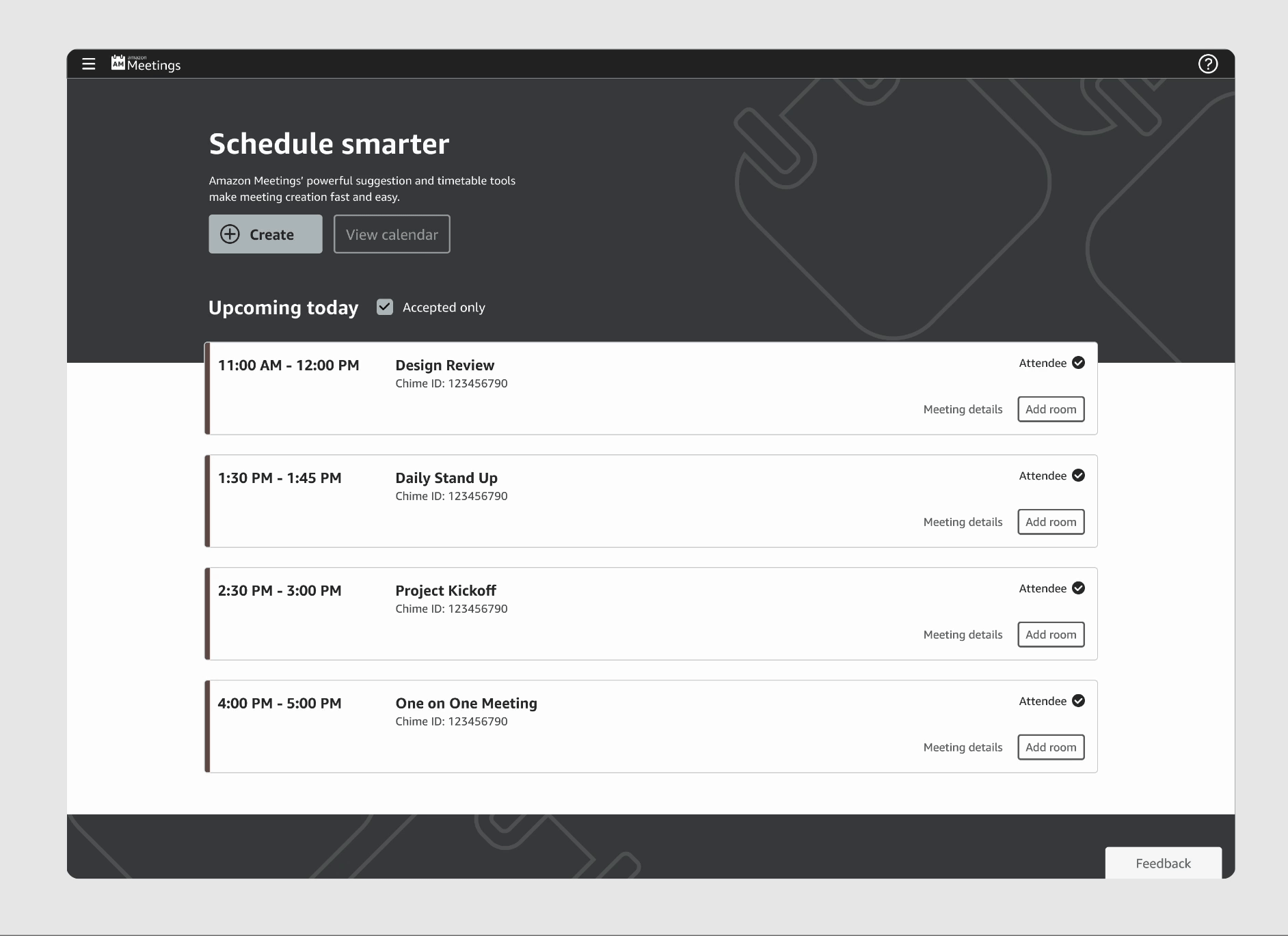
Amazonians use the Room Booking tool more than 300k times a month (2023). Now that Amazon’s Return to Office (RTO) started in May, room booking is even more important and usage is expected to increase.
Project Objectives
Conduct & Summarize Research Findings
Deliver a simplified flow for adding a room for to an existing meeting
Provide a smart suggestion components which recommends a meeting room (Optional)

Discovering & Filtering out the Right Participants

Wow? So this is what they’re going through?: Main Insights
-
Customers prefer to know all the details about a room before deciding to book it
-
Attendees who sit in a different office than the meeting organizer often need to book their own meeting room.
-
The current room booking system doesn't support recurring meetings, so customers have to book each session separately throughout the week.

Conceptual Design Phase: Getting my Hands Dirty!
My mentor accurately predicted that this phase of my internship would be the most demanding, and she was absolutely right! This phase turned out to be the most extensive part of my internship journey.

Current Pattern
The original design interactions for the card component was designed for an Amazonian you had to hover and select the card in order to review the meeting details in a modal.

The most effective way for Ryan To Discovering adding a room?
Option A Concept
Disabled the hover-select feature for the entire component, making the room booking button accessible for clicking. The previous interactions, like the modal, have been moved under the 'Meeting Details' section.

Option B Concept
Being cautious about if the ‘Book Room’ button would resulting in a possible cleaner layout. I minimized book room to singular button.

Option A Wins:
I chose Concept A because, as my UX mentor pointed out, while Concept B reduces the visibility of the 'Book Room' button, it disrupts the flow by taking users back to select a specific meeting.

Evaluating my Work & Trusting my Judgement

Multi-step: Not Going Foward
The benefit from this concept was it follows a similar pattern if Ryan was going to a create meeting. The learning curve would be easier
Modal: Winner
My intern manager and I agreed that the modal concept felt fast and efficient, aligning with user needs, so we proceeded with it.
Organizing The Priority
My modal concept gave too much space to pre-populated meeting info, overshadowing the room search. While the info was important, the design needed to better align with Ryan’s goal of finding rooms.

Is Disabled Right Choice?
To show Ryan that the room inherits the original meeting details, I disabled input fields. However, my mentor noted this could imply editability in some cases, so I switched to bold text instead.

Adding Attendees
The last feature I implemented enabled Amazonians to quickly add colleagues attending the same meeting and located in the same building, improving convenience and efficiency.

Simplified
After all the changes the modal design has became simplified at a first glance. Which is great becuase this new feature for the meetings tool will help users just get to the point of adding a room.

Daily Agenda Flow Prototypes

Button Group Component

View Calendar Prototypes


That’s a Wrap!
Learnings #1: Invent & Simplify
During this journey, each time I introduced a design concept that seemed headed in the right direction, my manager and mentor consistently encouraged me to explore alternative approaches to simplify it. Whether it involved reducing the number of clicks or reducing the amount content overload presented to customers, they challenged me to think critically about enhancing the user experience.
Learnings #2: Design Process is Not so Linear
In school I was instilled with the conventional design process, often depicted linearly as empathize, define, ideate, prototype, and test. While I wholeheartedly embraced and applied a similar methodology during my internship, I discovered that, when deeply immersed in the intricacies of my project, I frequently needed to backtrack from the research and conceptual design phases.