

Five to Nine (5-9)
Project Overview
During my senior capstone project, I set out to address the mental well-being of software engineers, who often struggle with burnout and work-life balance. I designed 5-9, a mobile app that encourages developers to disconnect from work and engage in meaningful activities.
Roles:
UX Designer
Team:
Just Me
Timeline:
2 Months
Tools:
Figma
Scope
The Problem
Software engineers dedicate long hours to their jobs, often in exchange for great pay. However, this comes with the pressure to constantly stay updated with the latest technologies and meet demanding work expectations.
As a result, many engineers struggle with burnout and have little time or motivation to engage in fun, fulfilling activities outside of work. The lack of structured breaks and social interaction can negatively impact their mental well-being, making it difficult to maintain a healthy work-life balance..
The Solution
Design an app such as Five to Nine (5-9) that’s tailored for software engineers to promotes their mental health and well-being by encouraging them to engage in meaningful activities outside their work environment. The name was chosen because most people’s outside working hours
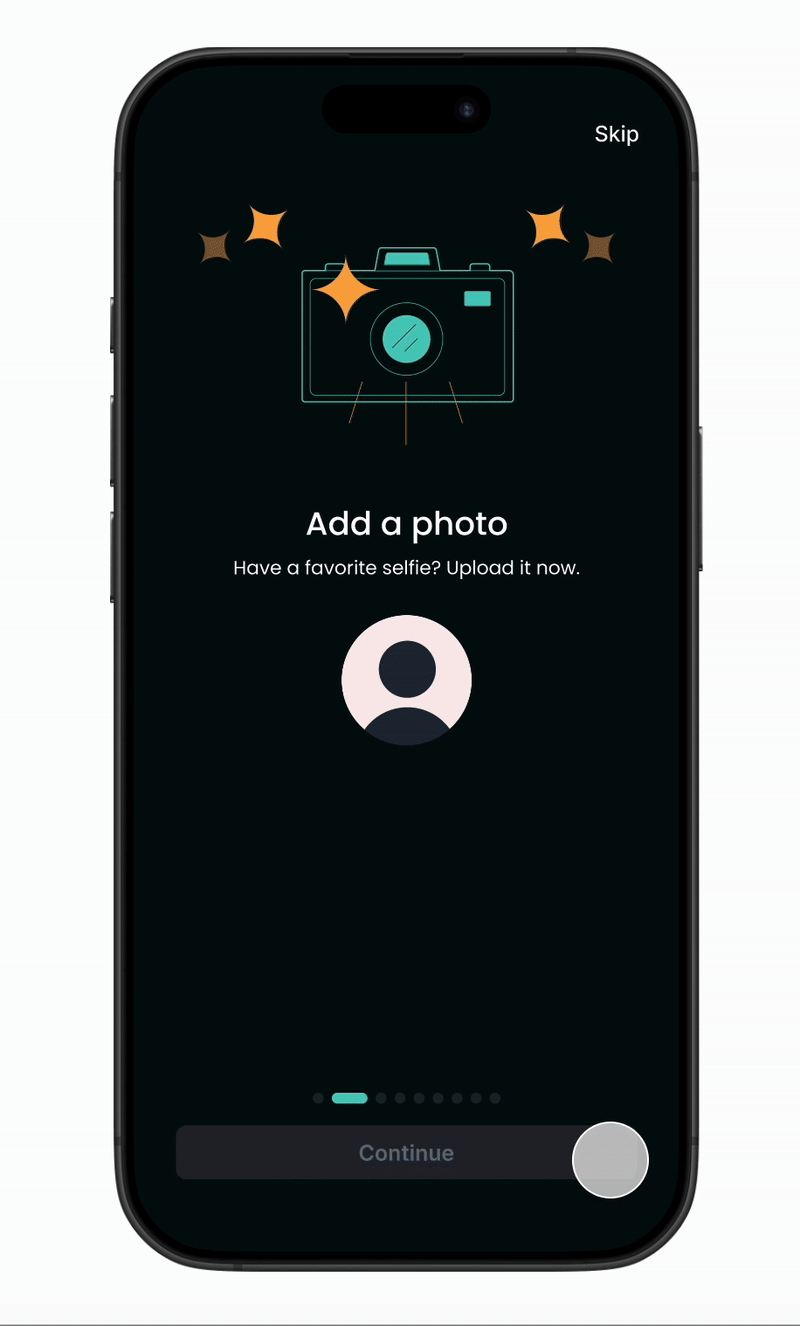
Tailor & Curate Your Experience From Onboarding:
Select activities of their interest into their feed
Create goals that match their level of interest & time.
Create goals that match their level of interest & time.
Tailor & Curate Your Experience From Onboarding:
Select activities of their interest into their feed
Create goals that match their level of interest & time.
Create goals that match their level of interest & time.
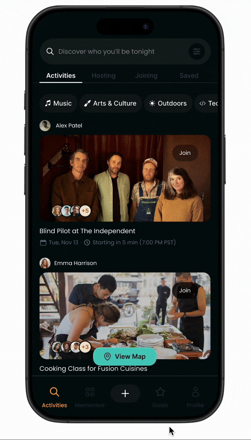
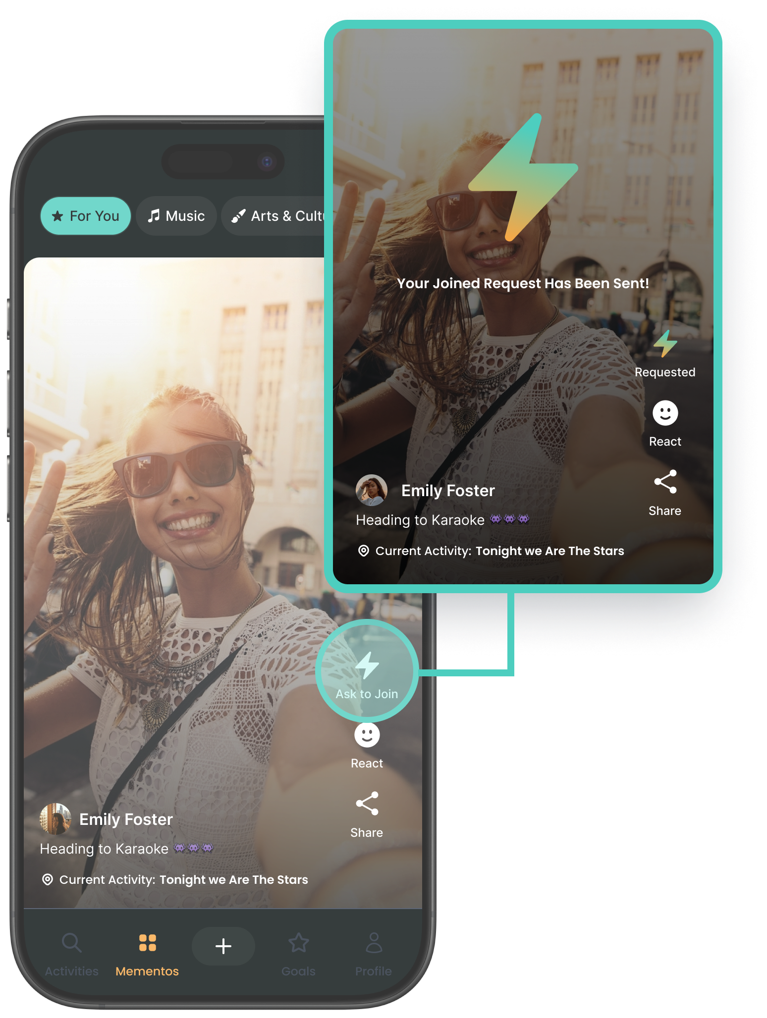
Discover and share with others from Momentos
Join others by discovering activites they’re doing
Share your authteitc expereinces filter goals that match their level of interest & time.
Create goals that match their level of interest & time.
What’s Out There?
Secondary Research
Some notable obersvations from these reports was widespread issue in the tech industry, with 76% of workers, including software engineers, reporting burnout, and 83% of developers experiencing it at work. Key contributors include high workloads (47%), inefficient processes (31%), and unclear goals (29%).
Surprisingly, research showed that company-provided mental health tools were largely ineffective, which led me to shift my focus from a workplace-driven solution to a B2C approach with 5-9, empowering engineers to take control of their well-being outside of work.

Competitive Analysis
The were many aspects I wanted to touch to with my solution that I thought could benefit software engineers:
General Mental Health
Socially Fun
Software Engineering Terminology & Stylish Treatment
Socially Fun
Non-Conventional Design?
Product Owner’s Early Mockup
Upon the product owner's request, I undertook the task of translating the stories crafted by iFp teen creatives into a map-like format. This venture posed challenges since it required designing a website in an unconventional manner, one that didn't primarily serve the purpose of locating specific places to visit.

Button Design
The core theme of 2Blocks has consistently revolved around the stark contrast between two neighboring neighborhoods in Cambridge. On one hand, we have Kendall Square, with its continually expanding innovation economy, and on the other, The Port, which is moving in a completely different direction.
To align with the theme of our message, I incorporated map-like location icons into the design of these buttons.

Balancing the Non-conventional
To maintain a balance with the unconventional map design, I reevaluated the layout of the original top navigation bar. Keeping Jacob's Law in mind, which suggests that users prefer websites that behave similarly, I opted for a redesign that adheres to a more standard approach.
For this original navigation bar with the hamburger menu, it caused an issue of communicating to users that you can only navigate the website with our map-layout because the stories were hidden in the menu. So it disregards users use cases who aren’t familiar with that approach and users who just want to get straight to the point.

Users might not want to always want to use a non-traditional map layout, the old navigation system hides the standard navigation in a dropdown menu.

User Friendly Alternatives
The Version 2 navigation bar provides users with a user-friendly alternative for effortlessly exploring the website's content, a marked improvement over the initial option. Furthermore, retaining the first option ensures the continued visual representation of the "two-block" theme, thus strengthening our intended design concept.


Prioritizing Visibility
My rationale for this decision stemmed from the recognition that if we prioritize a non-conventional design such as this map, we should also provide users with another more conventional means of navigating our website.
The new top navigation was a superior design choice as it removed the extra click required in the hamburger menu, making it easier for users to navigate through story names while also eliminating any potential use-cases that gave users confusion on the website’s discoverability.

Story Pages
In contrast to the homepage, I opted for a more conventional design on the page containing the video content. This decision was made to maintain a balanced and cohesive navigation experience throughout the website.

Prioritizing Responsiveness
Mobile & Web
Given the limited resources available to our team, it was crucial to ensure that the website remained accessible to not just web users but also mobile as well.
To achieve this goal efficiently, we opted for a "fully adaptable" design for mobile platform instead of creating separate versions for each platform, a decision made to conserve resources, streamline development, and meet our launch date.

Desktop Front-end Code
To achieve the adaptability on our website, despite our limited resources, was the incorporation of media queries. These media queries allowed us to create instances of both desktop and mobile buttons.

Mobile Front-end Code
By harnessing these media queries, I was able to ensure that the mobile button variants were displayed in a centered alignment when the screen reached a specific, narrower width. This approach was necessary because the map layout designed for desktop was too wide to accommodate for mobile.

Simplifying Components
As I was new to web development during this project, my tasks took longer than expected as the launch date approached. To simplify our code structure and complete prototype our prototype before the launch date, the volunteer engineer and I decided to start creating HTML components.
While modern design and engineering teams typically use frameworks like React to create web components, I was still in the early stages of my coding journey and had only mastered the basics. Creating components using HTML was a suitable alternative for our project.


Why Augmented Reality
Physical Installation
As I progressed in my web development work, I received a new feature request from our product owner. They informed me that the micro-site I was working on would incorporate AR components to complement an ongoing physical installation being developed by our 2D team.

Deciding the Icons
The AR feature was expected to be one of the most crucial aspects of the microsite, so it was imperative to make the user experience as user-friendly as possible. While creating multiple iterations of AR icons, I ensured that these buttons stood out distinctively from the other purple buttons that directed users to video stories.
To gauge the most comprehensible representation of AR within the context of the website, I conducted A/B testing with various teams at iFp. The final iterations that garnered the most recognition clearly conveyed that AR would be utilized on a phone.

The Hypothetical Ideal Flow
In the early conceptual stages, my goal was to create a straightforward path for first-time users, to get the to AR experience built by our 3D team. However, due to my limited experience in web development and technology, embedding our own AR feature directly into the website it just unfeasible before my deadline.

First Time Flow at Installation Site
Instead, the 3D team imported their augmented reality design into a third-party app called Hoverlay. We selected this app because it had proven to be effective in previous projects. I was then able to add their Hoverlay's link into the front-end code for the website.

First Time Flow on Desktop
For the desktop user scenario, I devised a process where visitors could scan the QR code at the 2Blocks installation, which would take them straight to the microsite. However, to view the AR experience through Hoverlay, they would still need to use their mobile phones.

Concept to Reality!
Mobile AR Experience
While at the physical installation site, this recording demonstrates the experience of using the microsite to access Augmented Reality on a smartphone.
Desktop AR Experience
If you're anywhere other than the intended physical location, the desktop version of the microsite also enables users to access Augmented Reality content.
Student Content
Explore the videos and content produced by iFp students to stay informed about the exciting educational and innovative job opportunities in Cambridge, MA, especially within the context of the larger challenges.

Launch Days!
Summit Events
We organized the design summits to unveil the initial MVP of the 2Blocks website. Cambridge residents and key stakeholders from our podcast and beyond had the opportunity to witness the showcased designs.
Community Engagement
We received substantial support, feedback, and raised awareness through the website regarding the 2Blocks initiative. This reinforced our belief that stakeholders from Cambridge's business and educational sectors are deeply committed to contributing their part in realizing 2Block's objectives.

Next Steps
Where do Visitors go Next?
At the summit, I received feedback suggesting the incorporation of "What is iFp" within the context of the website. This feedback centered on the idea of guiding visitors on their next steps after they had absorbed the information provided on the site. For the next iteration, I would develop more concepts to make it clear to visitors more about what iFp is all about.
More Code Simplification
As the event launch date approached, I had already converted some HTML scripts into simplified components, although not all were completed. To facilitate future modifications to the website, I will continue creating components, thereby streamlining the alignment between design and development
Learnings
Engineer’s Best Friend
One of the primary motivations behind my decision to participate in this project was to gain a deeper understanding of how front-end code functions. I held the belief that to become a more proficient designer, I needed to be acquainted with the process of constructing components from a developer's perspective.
Simple Yet Complex
On paper I thought because of the minimal content being added to microsite it would mean the design would be fairly simple to make. But what I later discovered, the interaction design challenges and coding challenges that made task a bit more complex and longer than I thought it would take. So going further no matter how simple a design challenge I need to always expect to plan and prepare to take challenges I wasn’t yet prepared for.